
Iconography: Your Game’s Alphabet
Nearly every game has icons. Fire, flip, exhaust, enchantment, wheat, windmills… there’s no end to the number of things your game might want to visually represent. Icons are so ubiquitous, in fact, that it’s one of the first things a game designer will consider hiring a graphic designer to create.
“So what makes a good icon,” you ask? That’s a good question, but not quite the right one. Icons don’t exist in a vacuum, and their quality can only truly be judged in the context of a full icon set. They’re not just individual symbols, after all; they’re a system of indicators that combine to convey information, much like the letters in the alphabet combine to create words.
We use the following principles when creating icon sets:
Icons in the set should be readable at small sizes or great distances.
Icons in the set should be visually distinct from one another.
Icons in the set should look like they belong together.
Icons in the set should be conscious of their context.
Readable
The most important consideration when designing icons is to ensure that the player can read them. Board games are played on tables using cards and tokens that need to impart a lot of information; it’s common for a player to need to read small print from clear across a table to check out their opponent’s tableau.
Beyond the simple realities of a table, there are plenty of other things that get in the way of reading. Games aren’t always played under ideal lighting. Players might also have vision impairments; one in twelve men is colorblind, so folks like us who design goods for this male-dominated hobby need to be particularly conscious of that disability.
With all the challenges to readability that playing games can entail, it’s important for designers to make sure they aren’t part of the problem.
Distinct
Have you ever mixed up p and q? How about D and O? It’s easy to do at a glance! When creating icons, we want to ensure that none of the members of a set resembles any other too closely so that mix-ups like that don’t happen.
The most important work on this front happens at the very start of the project. Before we start to draw, we’ll lay out all of the concepts that need an icon, and doodle just a silhouette of each shape. The reason we start with a silhouette is because that’s how the eye processes information. You’ll perceive the outline of something before you perceive the details inside it.
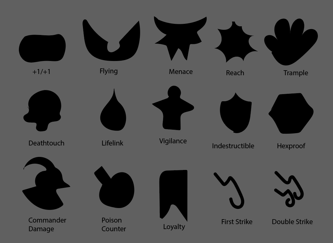
Silhouette sketches for a client’s set of MtG-compatible tokens.
This technique is used across many different types of design where users need to distinguish between multiple similar objects. Check out how the character designers of Team Fortress 2 used silhouettes to define their characters:
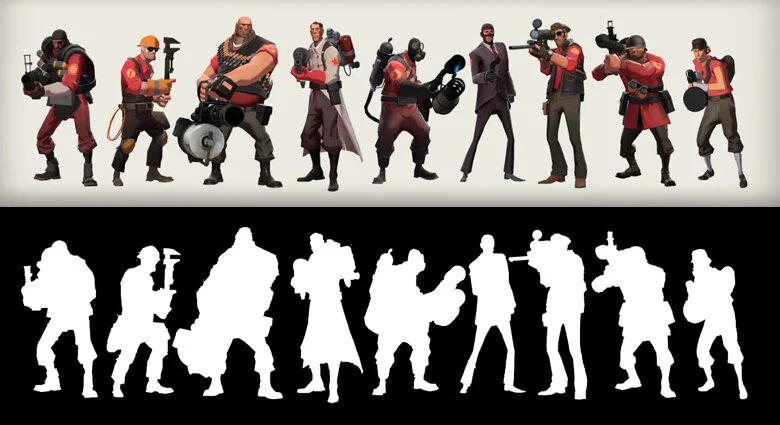
Changes in the characters’ build, stance, and weapon render their silhouettes immediately distinct from one another, allowing players to instantly identify who’s shooting at them!
Belong
Icons can be individually great designs, but they’re at their best when they work together with the full set. A group of icons should have similar line weights, similar amounts of positive and negative space, and use generally the same angles and blocks in their construction.
All of that may seem obvious, but it’s surprising to a lot of amateur designers who choose to make their own icons how tempting it can be to break the mold for just one really cool icon. Maybe your Fire Damage symbol would look better with a lot more licks of flame, and it doesn’t matter that your Earth Damage symbol is just a rock. No problem right?
Wrong. Your brain will naturally assign different levels of importance to objects of different levels of complexity. All of a sudden, your cool fire icon is making players believe that Fire Damage is more important than Earth Damage, or drawing their eye away from other elements on a card that are more important. It’s not enough for individual icons to look awesome; they have to work together to be maximally useful to players.
Context
What’s the difference between o and O? One is lowercase and one is uppercase, of course, but they mean the same thing; they indicate the same sound. The only real difference is there they appear: O only appears at the start of sentences and proper names, while o appears everywhere else. It’s therefore not a big problem if you mix them up, because they’re used in different contexts.
Icon design follows similar principles. If I’m making a Life icon and a Lifesteal icon, for instance, I’ll need to make them look really distinct from one another if they can both appear in the same text box. However, if Life only appears in a card frame, I don’t need to worry about making them look so different because they’re never close enough together for players to mix them up. In fact, it might even be good to make them look more similar so that the player can tell at a glance that Lifesteal affects the Life mechanic!
Knowing how icons are used in your game is the most important part of designing good iconography. That’s why we play your game as part of our intake process to ensure we know in exactly what context your icons will appear, because designing something as important as your game’s alphabet deserves expert attention.
FAQ’s
Still have more questions? Here are a few FAQs that we’ve heard from our clients over the years:
1. What exactly is iconography in the context of game design, and why is it significant?
Iconography in game design refers to the use of visual symbols or icons to convey information, actions, or concepts within the game environment. It's significant because it provides players with a quick and intuitive way to understand game mechanics, navigate interfaces, and make decisions during gameplay.
2. How can icons contribute to improving the overall gameplay experience for players?
Icons play a crucial role in enhancing the gameplay experience for players by offering quick recognition of actions, items, or elements within the game. They can streamline communication, reduce cognitive load, and facilitate smoother interactions, ultimately leading to a more immersive and enjoyable gaming experience.
3. Are there specific examples of successful implementation of iconography in popular games, and what can we learn from them?
Examples of successful implementation of iconography in popular games include the use of familiar symbols for actions like jumping, shooting, or interacting with objects, as seen in platformers or first-person shooters. Additionally, games often use icons to represent items in inventory systems, such as health packs or ammunition. These examples demonstrate how well-designed icons can aid player comprehension and streamline gameplay mechanics.
4. What are some best practices or tips for designing effective icons that are both visually appealing and easily understandable for players?
Designing effective icons for games requires careful consideration of factors such as clarity, simplicity, and consistency. It's essential to choose symbols that are universally recognizable and easily distinguishable, even at small sizes. Additionally, icons should convey their meaning at a glance and avoid unnecessary complexity or ambiguity. Conducting user testing and iterating on icon designs can help ensure they are intuitive and user-friendly.
5. How does consistency in iconography across different aspects of a game affect player engagement and comprehension?
Consistency in iconography across different aspects of a game is crucial for maintaining visual coherence and enhancing player comprehension. When icons are used consistently throughout the game's interface and gameplay elements, players can quickly learn their meanings and develop mental associations, which improves efficiency and reduces confusion. Consistent iconography also contributes to the overall aesthetic appeal of the game and reinforces its visual identity.