
The Modern Magic Frame
Magic: the Gathering was first released in 1993. It was immensely popular at release, and remains even more popular today, with over 35 million players across physical and digital platforms. The game has had a massive influence on generation of players, many of whom are becoming the next great game designers of today and tomorrow. Trends in Magic’s design are picked up and carried through hundreds of other contemporary games. It’s only natural that, as graphic designers, we should look at Magic’s graphic design trends too.
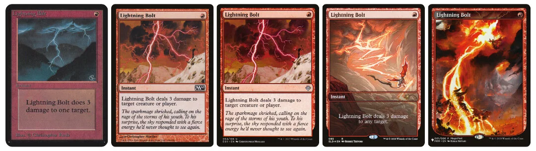
In this post, we’ll be looking at Lightning Bolt, one of Magic’s most beloved and oft-reprinted spells.
Alpha
Let’s start from the left. The first card you see is Lightning Bolt’s first printing back in the Alpha set. The first thing that strikes the viewer about this card is the texture: the red frame and text box has a stony look with beveled edges, and the artwork is moody and painterly. It’s apparent that this designer wanted the card to look like a literal object in this fantasy world, like a tablet with arcane inscriptions showing you how to cast the spell. This is right in line with how other fantasy games did their design in the 90s; look at a D&D book from the same era (like this book of equipment) and you’ll see plenty of textures and embellishments that lead the viewer to feel like they’re reading a real magic tome. Being able to role-play even while reading the rules of the game is hugely important for many fantasy game players, so this is an obvious decision to make, and one that we use all the time when providing creative direction to clients. Your graphic elements can do just as much work as your art in driving home your flavor.
That first template has some problems, though. The title and types are definitely tough to read, and the color isn’t particularly vibrant. The heavy textures and beveled edges also looked really dated by the time the decade was out. A change was definitely needed to update to a more modern look. At the same time, Magic’s scope was changing. For most of its history, the cards represented people and places on a plane called Dominaria, a place deeply rooted in mainstream Western fantasy tropes. Magic’s designers were interested in exploring other worlds: a sci-fi metal world, a Japanese-inspired world, and a sunlit world populated by creatures from Celtic folklore with no humans in sight. The type of craftsmanship represented by the old frame doesn’t make sense for all of those places, and might not make place for other worlds that Magic might want to visit. If the flavor of the world doesn’t match the flavor of the graphic elements, those graphic elements can actually work against building immersion for the player.
Eighth Edition and Mirrodin
These two forces - the need to modernize and improve the layout technically, as well as accommodate a wider variety of worlds - led Magic’s designers to update the card template with the release of Eighth Edition in 2003, using the second template in the above list. Notice the brighter colors, more clearly defined text fields, and bolder, less-calligraphic font (from Goudy Medieval to Matrix). The result is an overall more readable card, an important quality in a game with tens of thousands of unique pieces.
The change was not without controversy, though. Many players were disappointed by the reduction in texture and representative flavor, especially on black and green cards, whose text boxes were a tablet and a wooden sign, respectively. This frame also coincided with the release of the Mirrodin block of expansions, a metal plane with strong sci-fi influences that was a big departure from Magic’s typical look; this led some players to conclude that Magic’s flavor was moving too far away from the medieval sword and sorcery roots the game had largely stuck to over its ten-year run.
M15
Subsequent changes to the frame have been made since 2003, but these have usually been limited in scope or application. The last major change was made in M15, (the center card) with the introduction of a proprietary font (Beleren) and an update to the collector’s information along the bottom of the card. This was done primarily to make that information easier for printing machines to read, but I personally appreciate that it also helps make that information both more readable and less noticeable. Black is “border“ on Magic cards and doesn’t contain any game-relevant information; with that block of text sitting on black, I can immediately tell that I shouldn’t need to reference it while I’m playing. It also shaves precious millimeters off of the framing elements at the bottom of the card, leaving more room for text and art!
Promos and Beyond
The Eighth Edition frame is now seventeen years old (older than the original frame was when it was replaced!) and is showing signs of wear. While it was definitely an improvement over the original frame from a usability perspective, the strong borders and individual raised elements are all trends that have long since passed by in the design world. Magic’s designers are already pushing their boundaries of their templates when designing promo cards for limited runs, stretching artwork all the way down the card and only leaving the barest hints of their frames intact, like on the fourth image. Personally, I love these designs; the new frame was all about letting the art tell the story, so getting the framing elements out of the way so you can see more gorgeous art is a great execution of that intent.
Some truly iconic cards even drop the text box altogether, like the version on the far right. Just a name and artwork feels incredibly immersive. Obviously this won’t work for every game - only something with the market reach of Magic can reasonably expect you to know what a card does even with nothing printed on it - but it’s a great illustration of the principle that great artwork is the best way to drive immersion, and good design should remove obstacles to the artwork whenever possible.
What does this mean for your game?
Magic’s world-hopping flavor is somewhat unique; most of our clients only have one universe in which they set their game and only a limited number of possible expansions, so it’s easy to nail down a visual style for their graphic elements at the start and stick with it to the end. For these games, it’s often appropriate for the components to resemble objects in your world, because you know exactly what your world is going to look like; we’ve done immersive texture work like that in Blood Bowl and Legends Untold, and we think those themes work great in those games.
Don’t underestimate the power of great art by itself to immerse your players, though! Every second someone spends looking at your card frame is a second they’re not spending looking at your awesome art. Don’t be afraid to cut away some of the decoration and boil your card down to its essentials. If you’ve hired a fantastic illustrator whose vision is really carrying your game’s theme, like it does in a new Magic set exploring some far-off corner of the multiverse, consider taking a page out of Magic’s book and ask us about an ultra-modern minimal design.